
If you haven’t warmed up to the notion that typography is experiencing a full-blown reformation, let me throw a log on the fire. We are well into a new decade, deeply unprecedented in nature—inherently, this causes humans to take inventory of our progress and entertain future trajectories.
And in the design world, we supremely can’t control this urge. Massimo Vignelli’s 1985 schematic chart listed ideological and design changes over the 1960s-1980s. And this past year, PRINT’s own typographic schematic summary (developed by design house Gretel) charts a significant swing in the design pendulum. After three centuries of a Fixed Era, marked by neat walled gardens of stylistic movements, we have entered a Fluid Era, where all forms of type rove freely and intersect.
Does being in a Fluid Era of typography mean we can’t pinpoint our 2022 type vision? Not necessarily.
Kyle Chayka aptly summarized our current mood in a recent New Yorker piece, The Year in Vibes, writing, “It is a year that feels as though it does and does not exist, a hangover from the depths of terror in 2020 that provides a significant improvement and yet remains vacuous and unstable.” In the spaces between our shared uncertainty and collective rage, we tread optimistically in exhaustive isolation, finding creature comforts where we can. That, folks, is our 2022 “Spiritus Mundi,” our collective spirit of humanity.
It is no wonder then, in this zeitgeist of chaos and confusion, typography is having a second coming. Expressive typography has gone fully glacial. The assertions of legibility of the Bauhaus’ New Typography are getting fainter and fainter. The foundation poured by Jan Tschichold in his watershed book Die Neue Typographie (1928) is caving in and giving way. Now, form follows feelings more than function.
Typographers and designers are rebelling against absolutes. History has charted that typography will inevitably be subject to a restoring gravitational force (youth rebellion) that will accelerate it back toward the equilibrium position. Even so, the neat this-or-that classifications of the Fixed Era are emerging as this and that. International Style and Psychedelic. Rational and Anti-hierarchical. Type is breaking free. But why now? PRINT spoke to six design experts to help us survey the type winds of 2022.

Type doesn’t sit well-behaved on a page anymore.
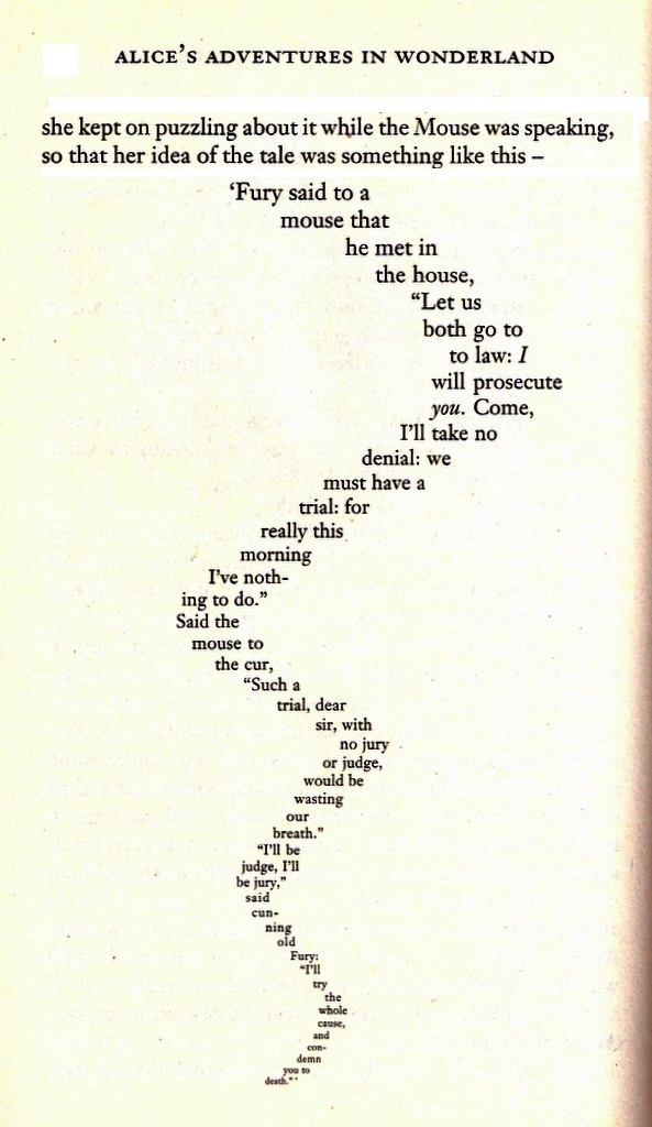
It hasn’t since Lewis Carrol shaped “The Mouse’s Tale” poem in his 1865 novel Alice’s Adventures in Wonderland. Letter setting has evolved into animated type and motion design. Typography moves, behaves, and performs in our expansive physical and digital world. It plays, feels, breathes, responds, and, to that end, is becoming increasingly interactive and experimental. If you look closely, type looks right back at you.

Typography is seeing a heightened level of energetic movement. By the 1910s, futurists like Fortunato Depero had codified this through letterforms that were kinetic, dynamic, and suspended in motion on the page. Now, letterforms travel in time, their pacing set forth by devices like variable fonts, letterforms, and line widths.


Emily Oberman’s team at Pentagram recently refreshed the brand identity for the Tribeca Film Festival’s 20th Anniversary campaign, where the type came alive through choices that favored the kinetic energy they strived to capture. Oberman admits, “We threw spelling to the wind, we threw space to the wind, and we even made these letterforms that traveled around the city and lived in different places.”


The primary typography is set in Druk, though we encounter each letter at a different position, weight, and size each time. Some letters repeat, rendering the words misspelled. Still, as Oberman puts it, it was “meant to feel human and expressive and out in the world and like it was dancing with you or for you.” The secondary type, used in communication-forward touch-points like supportive copy, is set in Basis Grotesque.
We wanted to express the joy of being back in the city and physicality, and it wasn’t necessarily reading the words for exactly what they were,” she adds. “It was about the emotion and joy of people being together. And that was more important to me than the actual reading of the words.”
Emily Oberman
And while Paula Scher re-energized the Dada approach of type movement with her iconic work for The Public Theatre in New York City in the early 90s, new technologies and frontiers are getting explored to heighten the nuance of motion like misspelling words and variable type.

But, according to Oberman, what motivates these new decisions is much deeper. “As designers and typographers, we have this moment where we’re trying to express humanity in as many different ways as we can. I love seeing as many different fucked up ways as typography is expressing itself at this moment in time, and I think it’s our way of escaping these boxes we’ve been stuck in for this lost two years.”


Neo-kinetic Specimens: Tribeca Film Festival, public theater, DÜE Display
VARIABLE TYPE Specimens: Neue Plak Variable, Futura Now Variable, Helvetica Now Variable, Noorge Karlos

Before, we had three basic styles of type: “Geometric Sans,” “Humanist Sans,” and a hybrid of both, the “Geometric Humanist.”
Now, a sense of warmth is creeping into all forms of geometric type, and it’s due to a softer edge. These are typefaces that hook you in with winking hints toward the brand’s visual identity and call-backs to shapes found in other assets: the subtlest curve, a squarer-circle, a flick, or an angle, and sometimes the shape of the product itself.
For textile artist Rebecca Atwood’s rebrand, Order’s co-founder Hamish Smyth and designer Emily Klaebe chose Chap Light as their primary typeface.


Klaebe explains what’s conformist about it and what’s not: “Chap Light is not only contemporary in that it’s a mixture between a sans serif and a calligraphic-based typeface, but it has those nods to historical design practices, which is important for the system and mirroring back Rebecca’s work as well because she’s very analogue.”
“There were a few areas where we had redrawn spots to feel custom to what Becca was looking for and align on a better balance between sharp areas and softer moments,” Klaebe explains in making it slightly defiant. “So, for example, the C’s were redrawn at the top to make sure it felt cohesive throughout.”
Order’s co-founder Jesse Reed has a hard and fast rule for selecting appropriate typefaces. “For us, it’s about finding meaning,” Jesse says. “If there is no meaning, we won’t have anything to do with it.”
“When we look at a company that is new, and they don’t have a lot of history, then we typically look at the history of an industry,” he points out for brands starting their story and developing brand meaning.
Organic and rebellious sans will be the face of neo-grotesques to come. Carefully manipulating the anatomy of these typefaces’ letterforms not only brings a personality and voice to a brand but will be the vehicle of the story.


If you’re looking for more neo-grotesques, head over to Order’s newly launched type foundry, cheekily named OTF, for .otf typeface files that blend long-term practical usage and original personality based on “research, intention, and detail.” Pastiche, designed by Benjamin Tuttle, is a solid choice, described as “type design fanfiction looking at late 19th century Gothics through the lens of mid-20th century Neo-grotesques.”
Specimens: Rebecca Atwood, Pastiche, Plebeian, Gaia Display, Grotta in use 2020 Weekly Diary realized for Hopipolla by Studio Mistaker

Ask type designers today, and many will echo Nicki Minaj: “I Beez in the Trap.”
That is the ink trap, of course. Ink traps provide a functional feature for some typefaces designed for printing at small sizes. At an ink trap, the corners or details get removed from letterforms, so when type is actually printed, the ink naturally spreads into the carved-out space, leaving the illusion of a crisp edge.
Now, it’s the new playground of letterforms. A small blip to experiment with, a crack at adding a quirk or nuance to make a letterform memorable, and wordmark more recognizable. “Ink Traps is an interesting example because the average reader or viewer doesn’t know about them, so it’s pretty much an in-joke or a self-referential commentary,” says design author and critic Steven Heller. “But I think people are doing it now because they can. It’s taking an official sans serif—corporate sans serif—and adding a personality to it, and that’s just the nature of the time and the technology we have. I’m not sure what the overall aesthetic is, but anybody spec-ing type for a book, booklet, or poster now that’s not going to use custom lettering will go for a letter that gives a little jolt or a little aftertaste.”
“It’s an oxymoron to use ink traps large because they’re meant to be used at 4-point type so that they fill in,” says Order’s Jesse Reed. “People have taken them to a new degree. That said—we’re guilty!”


But sometimes, they work.
As is the case with Floyd Ink Trap—the sister font to Floyd Gothic— designed by Order’s Emily Klaebe for a recent Floyd, a Detroit-based furniture brand campaign. They incorporated the idea of the shape of the leg first designed by Floyd and used that as the shape of the ink trap so it could become another expression for the brand to use in new releases of the product.


So if you “beez” in the ink trap, make sure it makes sense for your client. Austin Dunbar, the owner of Durham Studio, keeps it one hundred, not one hundred yards. “Bud Light has sales metrics and has to make a splash and sell a lot of beer,” he says. “Could you imagine if we gave them ink trap parties?” But, more on that later.
Specimens: Worth Agency, Floyd, CB, Sombra, Trench, Whyte Inktrap

Just like art, artistic or illustrative typography has a gazillion styles. Right now, designers aren’t just assigning typefaces to brands; they are making art with type, resulting in a maelstrom of display faces. “What everyone is pushing for with type is ‘what have we not seen yet that’s visually interesting?’” suggests Megan Bowker, design director at Collins and typography professor at SVA.
The surge in illustrative typefaces comes with some debate and a few disclaimers. “I think it’s a result of design becoming self-important,” adds Bowker. “Wanting to be seen so much, so badly, instead of really supporting the intent.”
So is ornament a crime, as Adolf Loos criticized in his 1913 essay? Loos illustrated his stance: “To me, and to all the cultivated people, ornament does not increase the pleasures of life. If I want to eat a piece of gingerbread I will choose one that is completely plain and not a piece which represents a baby in the arms of a horserider, a piece which is covered over and over with decoration. The man of the fifteenth century would not understand me. But modern people will. The supporter of ornament believes that the urge for simplicity is equivalent to self-denial. No, dear professor from the College of Applied Arts, I am not denying myself! To me, it tastes better this way.”


Today, the ornamentation we are seeing in typography is not only self-affirming but also a conduit for connection. Typographers today aim to move you with type the way a painting or a song does. But they only have about two seconds to create a bond or crack your heart open.
Expressive type has a chokehold on designers today.
Type is more free from the strictures of what had held it in place for so long since the Fifteenth Century.
Steven Heller
“So there are many more needs to attract attention and many more media in which to do it,” Heller adds. “We do it by words, we do it by music, we do it by visuals, and type can embody all of those things. It’s visual, it’s what constructs a word, and it’s musical.”
Segol Typeface, designed over two years by Moshik Nadav, is a highly stylized typeface with a nod to the swirling-haired beauties of the Art Nouveau movement. It features distinctive ligatures, sensuous swashes, and an array of alternate glyphs. As Nadav says in his YouTube video, “It’s a typeface where I wanted to include all of my craziest ideas.” It gives designers the ultimate freedom to customize what is already a highly stylized typeface.


Artistic Specimens: Segol (the cover of the new issue #6 of @missionmagazine), Artistic Type Bundle by Barrett Reid Maroney, including Kafka, Oldenorth
In fact, we’re seeing a resurgence of Art Nouveau-inspired type, which borrows the flowing organic motifs and strong, long wavy lines that embody the vitality, motion, and continuous occurrences of vibrant city life. And just as no object was too mundane to be beautiful for the 49 artists that succeeded from tradition in Vienna in 1897 in favor of a “New Art,” no letter is too ordinary to be exquisite.


This Neo-Mucha typography movement emerging now is type hedonism at its most aristocratic, an endeavor to relish in the skill and craftsmanship of letterforms, putting distinct and showy touches here and there.
While the original movement of Art Nouveau was known as Style Mucha for its founding designer Alphonse Mucha, who took inspiration from the unruly aspects of nature, the elegant resurgence is a more controlled, refined one likely to remain in our visual landscape. Pass the champagne + biscuits!
Neo-Mucha Specimens: Brier, Molen, Briar, Ladybird Light , Tumble Wordmark by Tongue Studio, Orna, Agne, Tenebras.
Or don’t. Ornamentation-mania as a type movement might go out of style and become obsolete. Sometimes type just has a job to do. That is especially true for the distinctly different design studio, Durham, based in Kentucky. They shamelessly own the space they thrive in—branding cigars, beer, whiskey, and other good-time stuff.
“I would challenge the majority of this expressive type work as work hidden behind a computer and not client forward,” says Durham founder Austin Dunbar, offering a counterpoint when it comes to incorporating ornamentation and artistry into typography.
Whether the client is large and global or small and local, if they can’t read it and it’s not legible, it’s not going to work.
Austin Dunbar
But even Durham, a buttoned-up but untucked, hand-in-hand brand building studio known for their type work for “man brands” has a softer side. Now, as the Cincinnati Ballet’s agency of record, Dunbar admits, “we can get artier there, but we still have to be able to communicate an idea.”
The surge in artistic, expressive typography is one trained designers welcome, but with measure. Jesse Reed reminds us of an obvious but forgotten truth:
Know the rules before you break them.
Jesse Reed
There are two schools of approach for artistic type; those that study and worship type anatomy and those who don’t. And Reed’s trained eye can spot the difference.
“Now I think it’s about not breaking the rules, but having no rules to break,” Steven Heller argues. Will artistic, swirly, ornamental type continue to mushroom in the coming year, or will it be short-lived fruit? Heller supposes, “Some of it will turn out to be beautiful. Whoever’s definition of beauty we are talking about, and some will turn out to be overdone or over-the-top. I also think typography today is a visceral craft, so you want to be moved by it whether it’s static or in motion.”
When approaching artistic typography, mind your Ps and Qs. Dunbar warns that, without sharp topography skills gleaned from formal training, designers today will suffer inevitable pitfalls. “Typography now is like tattooing,” he says. “People have a computer and can make whatever they want and put it on the internet. The formality of type as a religion isn’t really practiced as much as the religion of trade. Now you have free-for-all because the internet says you can do that. I never see a design firm that I’m really into applying all that wacky, kooky stuff. Again, they don’t want to be in the same sandtrap of time.”
“I’m trying to make work that clients don’t have to re-do in two years,” he adds.
Any way you slice the gingerbread, plain or decorative, artistic type is a matter of good taste.
Still, there’s a secret to making an artistic typeface that will stand the test of time. If you ask Megan Bowker, you start with classics.
This insatiable desire for the unseen is to actually use familiar things in ways you’ve never seen before, Megan says. That, to me, is true mastery. What I love about classic typography is that it proves you’re making it interesting.
Megan Bowker

It’s no surprise that designers are turning on and tuning in to a new form of type, conceived by the Psychedelic era and sharing strong DNA.
Just as words will always exist, so will drugs and countercultures. That’s why we see a constant evolution of squiggly, wavy letterforms in our visual world. The Art Nouveau movement, made famous by its long-haired maidens, was not just inspired by the swirling forms in nature; it was also the absinthe, morphine, and opium used to expand their perception.
And if we are seeing more visual evidence of Art Nouveau’s influence, we are certainly seeing the auras of Psychedelia! Psychedelic typography in the 1960s took Art Nouveau forms, dressed them up in electric colors, and sent them marching alongside comic-book and surrealist references on gig posters.


Art Nouveau’s Jugend magazine and the gig posters of the Hippie youth movement share visual forms that communicate youth + experimentation + social rebellion but not by random coincidence. Many San Francisco-based designers and artists saw the University of California’s 1966 exhibition “Jugendstil and Expressionism,” which featured poster art of Germany and Austria from 1893 to 1934. That inspired a re-imagining of the “Cult of the Squiggly,” as Steven Heller named it, through the lens of acid trips, reefer madness, and rock-n-roll.


“Psychedelia is a specific reference to a specific time in the communications culture,” says former longhair Steven Heller. “It was attributed to drugs and symbolized that kind of experience in the style that came from it. If it had happened in another time and place, which it did in Art Nouveau, it would be considered Art Nouveau. It would be considered whatever time it happened to appear, and the historian in all of us would peg it to that time. I think the things you are seeing now are a combination of factors.”
So when will typography fall out of love with the psychedelic noodle-y stuff?
Literally never. But, if you’re going to drink the kool-aid, make sure it’s microdosed. “If you’re trying to posture above and always be ahead of the curve, you’re really just asserting your awareness of zeitgeist and where you sit on that spectrum,” Megan Bowker warns. “Trends now move so quickly, so you can expose yourself just as quickly as being out-of-touch.”
“If we’re using metallic, psychedelic, goopy letters, I would much rather see an elegant, crafted, gorgeous, controlled form,” she adds.
And that’s indeed a tightrope-inspired act. You might even face the same criticism the longhairs did in Art Forum (1966) when critic Palmer D. French wrote, “But this superficial cribbing of the schematic formulas of early Art Nouveau by the Hippie artists invites comparison, and comparison betrays the weakness and untutoredness of Hippie art.”
Heavy.
Neo-Psychedelia Specimens: Rabbit Hole Display, Larma Studios, Migaela, Oh No Type Co.’s Psychedelic Psampler Molen, XULO branding, Gass Records by Eric Hu

In 2017, The Henry Ford Museum in Detroit hosted House Industries: A Type of Learning, capturing the enigma of the creative process in an exhibition format. Along with their book, The Process is the Inspiration, Delaware-based House Industries visualized how childhood interests became eclectic fonts and the ways hot-rod and punk rock culture inspired a fuck-around-and-find-out approach to the design process.
Those same tenets would lead House, in partnership with Shepard Fairey’s Studio Number One, to create a new visual identity for Los Angeles. With a mid-summer 2021 launch that coincided with the city lifting strict Covid-19 restrictions, the multi-colored, decidedly retro logomark aims to unify a sprawling mass of multicultural Angelinos while alluring new visitors.


Getting that perfect blend of California’s dreamy sunshine and unmatched street style came from blending each studio’s nostalgia trips. Fast Company reported that Fairey was “inspired by classic art deco, hand-painted signage, and Mexican restaurant scripts.” While, according to their Instagram feed, the “House kids devoured everything birthed from LA while growing up on the east coast. From hot rods to Hollywood, modernism to music, Los Angeles has embodied everything that inspired us to start our design studio. Still, we all knew that Ken’s [Barber] raw marker sketch captured that scriptural spirit we love about an Alva deck, a Kings snapback, and the Musso & Frank’s neon sign.”

Megan Bowker shares the same perspective. Despite growing up in one of America’s most desolate places, she found inspiration in the mundane. “I grew up in Alaska, which is so removed from visual culture,” she says. “There are just strip malls, so people make fun of me because I like the boring-est shit.

I love Times New Roman. It’s something you see every single day, but it’s timeless and well crafted.
Megan Bowker
She can even remember when she became aware of the designed world. “I was at Walmart when I was seven years old, and I asked my Mom who made the toothpaste packaging. I recognized that it was someone’s job.”
And that’s still what she finds most rewarding about design now. “I think the point of anything we make is to connect to someone. I am so inspired by making really accessible packaging for Target because we are creating artifacts that live in people’s homes. And things that live in people’s homes, people have memories of, and it makes up their lives. You make their life more delightful.”
It’s with this spirit she created the design of Target’s More Than Magic line, an inclusive brand for tweens that, according to the COLLINS’ case study, “says yes to magic, self-expression, and a sequence or two.”


“I was designing for my young self,” Bowker says of her wistful longing. “We were inspired by our own nostalgia and thinking about Lisa Frank and the things that appealed to us. In thinking about the voice for this brand, I saw the assortment of products, and it was like unicorns and tutus.”
The initial girliness of the brand was a challenge at first. But Bowker shared that Brian Collins encouraged her and the team to lean into it and not hide it. The final wordmark, which is as charming as meeting a tween with all the dreams in the world, gets supported by an all-embracing color palette. The magic of the illustrated wordmark is that the word “girly” now can have infinite meaning.
“Someone actually unpacked in on Fonts in Use, and they figured it out! We blended two fonts to get the right characters we wanted,” she admits about the tye. The team used a modified version of Dave Rowland’s Quinella, sometimes with caps from Duckie (also his). The secondary packaging typeface is Armin Brenner’s Voltaire.
“You will always have a love for the things that you did when you were young, and now we are the ones informing visual culture,” she says.
Choosing type is an expression of your identity. You can’t pinpoint why you’re drawn to it, but it’s based on who you are, your experiences, the association that you had through time.
Megan Bowker
Even for Durham, some typography selections come with personal nostalgia and history. Take their branding for Cigar Club.


“I wanted it to look like something that could be in the Playboy Club back in the 70s,” says Austin Dunbar. Like if it was a matchbook on the table. From the A to the R, there was an oval drawn there to knock off the serifs, so you had this nice rounded nature that rounded you up to the C. To me, good is in the details.” So even for a type purist like Dunbar, who promises that his tombstone will say “Austin let the type do the talking,” typography is not unfettered from the associations a designer holds within memory and the nostalgia trips booked daily.


Nostalgic Specimens: More Than Magic, Cigar Club, Los Angeles by Studio Number One and House Industries, Good Girl, BN Modern Ombra, House Industries Fonts

Brands are increasingly moving towards gender neutrality and inclusiveness.
And even for studios who work in categories traditionally marked as masculine or feminine, there is an awareness of striking balance and equity in type design based on the times we live in. “Durham has a male-forward brand aesthetic to it, but a majority of our clients are female,” says studio founder Dunbar. “So even for some of our ‘man brand’ clients, there is a female CEO or marketing vice president.”
“Even if a brand is strong and bold, there has to be a finesse to it,” he adds.
So what do you do when a brand is literally communicating inclusivity? Emily Oberman’s team at Pentagram faced this challenge when they did the brand identity, strategy, messaging, and digital design for serif, a new space connecting LGBTQIA+ communities through curated experiences and good ol’ real-time conversations.


“The LGBTQIA+ community is so varied that we wanted something that was all about convergence, that was a place where everyone could feel comfortable being who they are and understanding they were welcomed and where people could also make connections,” explains Oberman. “It’s all about bringing the community together.”
“We wanted an identity that was for any identity. So we love the idea of it being this beautiful, fluid piece of typography that is elegant in and of itself but can fluidly change and morph and be whatever it needed to be. But it also has a little bit of uniqueness and weirdness in it. Because we are all unique and weird in our own way.”
Designers are adding softer, rounder, or more calligraphic edges to grotesques not just to add finesse or visual balance, but because, as a culture, we are working to become more inclusive, though not perfectly so. Typography is just catching up with the notion of gender inclusivity. But will it ever lead?
“My whole life, I’ve been a bold sans serif person, but I don’t think that means I choose masculine over feminine type,” Oberman says of her own experience of choosing gender-agnostic type.
I have always balked at the idea that, because I lean towards a more strong or heavy kind of typography, that I’m choosing masculine typefaces. I choose expressive typefaces.
Emily Oberman


Bold, condensed fonts aren’t masculine anymore. Scripts and ornamental flourishes aren’t inherently feminine. Should there be more they or them for typefaces? Absolutely.
Gender-Agnostic Specimens: FOLX, serif

Would you believe that the wordmark of one of the most timeless brand-of-the-ages resulted from an experiment writing the company’s name in Spencerian Script (the more beautiful cousin to Copperplate)? In 1886, two founders leaned heavily on what was the standard American cursive, something that could be done quickly and legibly.


The brand? Coca-Cola, a name suggested by Frank M. Robinson, as he felt “the two Cs would look well in advertising.” A similar version of Frank’s first vision remains today.
Today, designers strive to create more connection through type, and it doesn’t get more personal than an individual’s penmanship. “I feel like at this moment in time, when we are locked so much in these little boxes, when we interact with each other so much in these screens, when I’m not talking to you in real life, there’s no physical reality and expression. And expressiveness is so important,” says Oberman.
If we as designers can express ourselves in typographic ways that feel alive, that is so important.
Emily Oberman
Take Bud Light’s recent NFL collaboration, something the company has been doing for years to connect with NFL fans that decidedly love beer as much as Homer Simpson. For this year’s campaign, Durham “let the type do the talking.”


“The concept was inspired by the fans and the fans’ signs, and the fans could always say whatever the hell they wanted to say,” Austin Dunbar says. “It was always hand-drawn, and it was always crazy looking for the most part.”
The Durham team achieved the sonic experience of being at a game. “You can’t hear yourself think,” he adds. “And that’s the bit. If we want to capitalize on fans going back to the stadium, you damn well know they are going to be a hell of a lot louder than they were in 2019 just because they are pumped to be back.”
“You can’t hide behind type,” he continues.
We wanted it to be expressive, inspired by fans in the stadium and their handwritten expressions of hoo-ra or fuck you, and we sold this bill of goods as ‘type is texture’ and as the fabric of the campaign.
Austin Dunbar
The campaign is mostly simple—team colors, logos, and, of course, Bud Light. But you couldn’t hide behind the players or a render.
“We also were drawn repeatedly over the pandemic to handwriting,” Oberman says about the enthusiasm for this handwritten movement. “2020 marked SNL’s 46th season, and for the first time in the show’s run, imperfect handwriting in vibrant, punk rock colors introduced the cast in the opening title sequence.


“We wanted to make stuff with our hands as opposed to setting type,” she adds. “That was a way to make connections with people, to sort of say, like the Whos (from Dr. Seuss’s Horton Hears a Who) when they’re stuck in that little thing that Horton’s carrying around, ‘we’re here! we’re here!’ It’s just to feel like we’re not alone in our apartments or stuck in our houses or invisible behind masks.”
Creating a type with script is no longer a mechanical feat. How many PDFs or Docusigns did you sign these past few years with the same computerization of your name? Designers now have the technology to create type with all of the inconsistencies and imperfections of handwriting.


For the Rebecca Atwood Rebrand, Order went through a process of replicating her handwriting with specific brush tools that worked within the brand’s system on an iPad, developing a personal touch that has always been integral to the brand.
Handwritten typefaces today have soul, and the written letterform has the unmatched ability to be the unique snowflake that is the mark of every human.
Specimens: Return of Fomo (Zuzanna Rogatty), Bud Light fan sans/ Bud Light fan sans light, Rebecca Atwood, SNL

We’re undoubtedly at the doorstep of this new Fluid Era of design. Will type knock politely or kick down the door?
Typography in the foreseeable future will be our visual salve in precarious times. When faced with a viral pandemic that refuses to have a last stand, rising protests as century-long fights for racial equality and reproductive rights continue, not to mention a return to our regularly scheduled school shootings, we can’t help but define ourselves and communicate through letterforms with more beauty and humanity.
Some artistic typefaces will die on the 2022 vine, and some will blow away like dandelion fuzz. And for the flowering neo-categories of expressive type emerging? A Superbloom awaits. The sea changes reflecting our messy times, current technology, and desire for connection will methodically sow a phenomenon.
It’s possible that in 10 years, the expressive type glacier we find ourselves on will slowly thaw, and the meltwater will nourish a new direction that will swing towards more rational, universal, and clear letterforms. Perhaps the next generation of designers—and even some of you—will want to quiet the post-pandemic raucous that is beginning to swell.
Right now, it’s a cold world out there, one full of restrictions, mandates, mutations, and isolation, with designers and typographers begging to—as once elocuted by Freddie Mercury—break free.
While our own personal freedom continues to be confined, type—whether it’s moving, emotional, artistic, organic, rebellious, nostalgic, fluid, or personal—is one way to show there’s a real somebody behind the type. After all, as the Who’s taught us:
“A person’s a person, no matter how small.”
To all you typographers and designers out there living on a speck of dust, throw another log on the fire. You’ve got a whole year before we do this again. Your assignment? To reveal the unseen lying dormant in your mind. It doesn’t have to be cool—just make it meaningful. And always celebrate the ceremony of typography. Superblooms defy the harshest deserts. And the loneliest ones.

Meg Farmer is a whip-smart culture vulture who writes honest heartfelt criticism framed by the pulse of the day, thorough research, and design history. Based in Los Angeles, she is a graduate of the renowned Design Criticism MFA program at the School of Visual Arts, where she received the first Steven Heller Design Research Award for her investigation into how the universal symbol for poison once failed. Meg has over a decade of experience working in art production firms, architecture firms, and design firms, including Pentagram, Collins, Huge, and Snask in Stockholm, Sweden. Her fervor for design and the way everyday people use it inspires her to bring design literacy to all. She was a Professor at the University of Cincinnati’s DAAP program, teaching both graduates and undergraduates in several design history, criticism, and thesis courses. After a long day of writing, she loves hiking with her dog Gidget, learning how to surf, and touring Los Angeles’ art and design scenes.