
The number one essential thing to keep in mind when selecting the best web fonts is scalability. Pay attention to when the fonts scale to either a smaller or larger size for different screen sizes that the fonts remain legible. That’s pro-tip number one. However, there are other crucial considerations to keep in mind when selecting the right web fonts.
I’m currently in the process of taking the Web Typography course from HOW Design University and Sessions Edu. In the course, I read this microscopic analysis of the four major system fonts and their web font counterparts. While reading this detailed overview of the fonts, I thought to myself that I would love a guide explaining what characteristics for not-so-common fonts to examine when selecting the best web fonts for a project. The next few sentences in the typography lesson granted my wish:
“Finding the perfect font is a complex business, with many factors to consider. Here are some tips for choosing Web fonts.”
This is exactly what I wanted. I know other designers would love this comprehensive list as well, so I’m sharing this with the Print community. This might be a refresher for many of you. Regardless, it’s a handy checklist to keep up on your browser for when you are building a new web design project.
Tips for Selecting the Best Web Fonts
by Instructor Piper Nilsson
Here are some details to consider as you decide whether a font is right for your project.
x-height
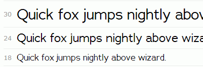
A font’s x-height refers to the height of the letter x (or u, v, w, and z). Compare the text below. Garamond has a small x-height; Meta Serif has a large x-height. Both text samples are set in the same 16px font-size, but Meta is much easier to read.

If you fancy a font with a small x-height, you can still use it, but you’ll need to use a larger font-size to compensate.
Apertures
Look carefully at the openings in the letters e, a, and c. These are their apertures.


Tightly drawn apertures close into o‘s at small font-sizes. Open apertures remain legible.

Bowls
Consider the shape of the rounded forms within the lowercase letters. Condensed fonts have narrow bowls, creating a compact appearance in large display settings,

but the compressed letterforms are hard to read at small sizes.

Extended fonts create bold headings, stretching words to dramatic effect,

but the bowls appear too round and too big when read in longer text passages.

Good text fonts have regular proportions.


Terminals
When studying a serif font, look closely at the letters a, r, and f. Do the strokes end in a ball terminal (a circular dot), or a beak terminal (a sharp spur)? These details may be the determining factor in a typeface’s personality.


When looking at sans serif font, notice the j, l, and t. Do the terminals end in a straight line or a curve?


Futura is beautiful in its simplicity, but Apertura’s curved terminals aid legibility.


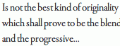
Letter Spacing
Many free fonts contain beautiful characters, but the typographer didn’t have the time or resources to devote to proper letter spacing. Ligurino has nicely shaped letterforms. This should read well as a text font.

However, at the standard 16px font-size, the letter spacing is too tight. The letters clump together.

Before choosing a font, check the lette
r spacing at your desired font-size.
Unique Characters
Scan your font for unique characters that stick out from the rest. This is a particular concern with script fonts. Reading the quote below, my eye gets stuck on the repetition of the letter y. The script looks fake, because, in real handwriting, each y would be slightly different.

The same quote reads better in Myriad Tilt, which has a more even texture.

Italics
When you choose your font, consider whether you will need an italic setting. Junction is a fine font, but it doesn’t come with italics. If you try to set the font in italics anyway, the browser will be forced to create a fake italic by slanting the text automatically.


The results are far from ideal. The angle of the L is awkward, and the a looks squashed. Look for a font with an italic setting designed by the typographer.
Meta’s italic setting displays nicely shaped letterforms. The double-decker a converts to a single decker, which flows better with the text.


Bold
Likewise, if you need to use bold text, make sure that your font has a bold font setting. Otherwise, the browser will bold the font automatically. In the fake bold text below, the top of the r is flattened. Also, the ear of the lowercase case g has lost its nice shape.

Meta’s professionally-designed bold font-weight has clean outlines. It is a bolder bold than the fake Junction bold, with better contrast against the regular text style.

Numerals
Numbers may form an important part of your text content. Consider whether you prefer uppercase numerals with an even baseline.

Or lowercase numerals for a more traditional style.

Cross-Browser Rendering
Check Browser Samples to see how your font holds up cross-browser.
Adrianna renders nicely in Chrome on a Mac.

In Chrome on Windows 7, Adrianna loses its quality.
Rendering is a particular concern when you use a modern font with thin serifs. Acta Display was designed for large display type. On a Mac, the letterforms have good contrast down to 30px. Smaller than that, and the details get fuzzy.

Acta is even lighter in Windows 7. The thin serifs fade away.

To be on safe footing cross-browser, use Acta at large display sizes, above 72px. If you need to use a modern font at smaller sizes, look for a font with heavier serifs, like Kepler, shown below as rendered on a Mac.

Kepler’s heavier letterforms render nicely in Windows 7.

Genealogy
To wrap up, do some research on the story behind the font. Who designed the font? Was the font designed especially as a Web font, or is it a digitalized version of a traditional print typeface? Does the font include a companion font of another classification?

Read the font description at the top of its Typekit profile page, and reference the foundry information in the sidebar.

Foundry sites often provide in-use galleries.

Seeing the font in-use is better than any specimen sheet. You’ll get a feel for its texture and style.

Enhance your web designs with the latest techniques for styling, typesetting, and embellishing web typography when you enroll in the Web Typography course. Learn more here.