
Based in Spain, fagerström has crafted the beautiful branding system for Rattha Studio, the Dubai-based architecture, and design studio. The new branding system reflects how the studio challenges the limits of architecture through new solutions through simple and elegant designs. If you look closely, the two "T's" in the name are close together to represent the Pi Symbol, as mathematics is at the root of design and architecture. This subtle element proves that the company is focused on the details and the intricacies of design. Rattha's branding is purposefully simple, allowing the true nature of the company to shine through.

Rattha Studio is a new Dubai-based architecture and integrated design firm founded by architect and artist Sahil Rattha Singh, whose work 'Haweia' was awarded the 2020 Christo and Jeanne-Claude prize, which seeks to encourage the creation of new artworks in the UAE and serve as a launch pad for visual artists throughout the Emirates.
Rattha Studio aims to improve the lives of people and societies through architecture and environment design. Based on close communication and collaboration with its clients, the studio seeks to challenge the limits of architecture, searching for new, unique and inspiring solutions.
Sahil and his team came to fagerström because they needed to develop the visual identity for their new architecture studio, which should reflect the quality of their work, communicate their value proposition, and serve as a platform for the firm to achieve its ambitious goals.
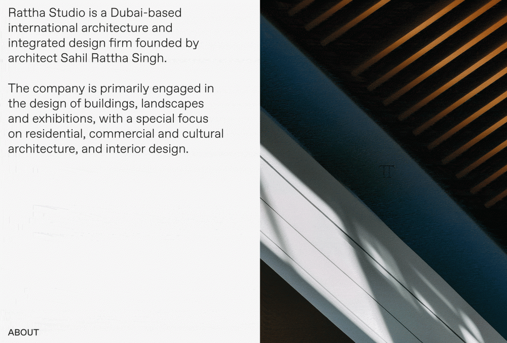
The brand is based on two concepts that are an essential part of architecture; mathematics and pillars. The logo is a wordmark in which the two letters 'T' of the name come together to represent at the same time the Pi symbol (π), a number that is present in any construction that includes rounded shapes, and two pillars that support the load of the horizontal bar of both letters.
The result is a clean, simple and elegant brand, which subtly integrates an iconic and recognizable symbol, which helps us to communicate the strategic concept and put the brand in context.


Project Credits: