
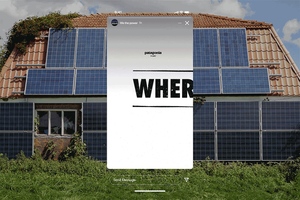
Documentary film and initiative by Patagonia, We the Power, is an encouragement to viewers to imagine a world where fighting energy poverty and placing money, control, and decision-making back into the power of the communities is a reality we live in.
The strategy and design for the launch of the initiative, designed by Upperquad, is empowering, uplifting, and playful. The rugged aesthetic was thoughtfully chosen as it represents a hands-on and creative feeling. This initiative is all about rolling up your sleeves and making a change, exactly the sentiment voiced from the branding system

We The Power, a new documentary film and initiative by Patagonia, encourages viewers to imagine a future of citizen-led, community energy initiatives that help combat energy poverty and put power, money, and decision-making back into the hands of individuals and communities; empowering people to join, invest, create, or lobby for localized energy systems in their towns.
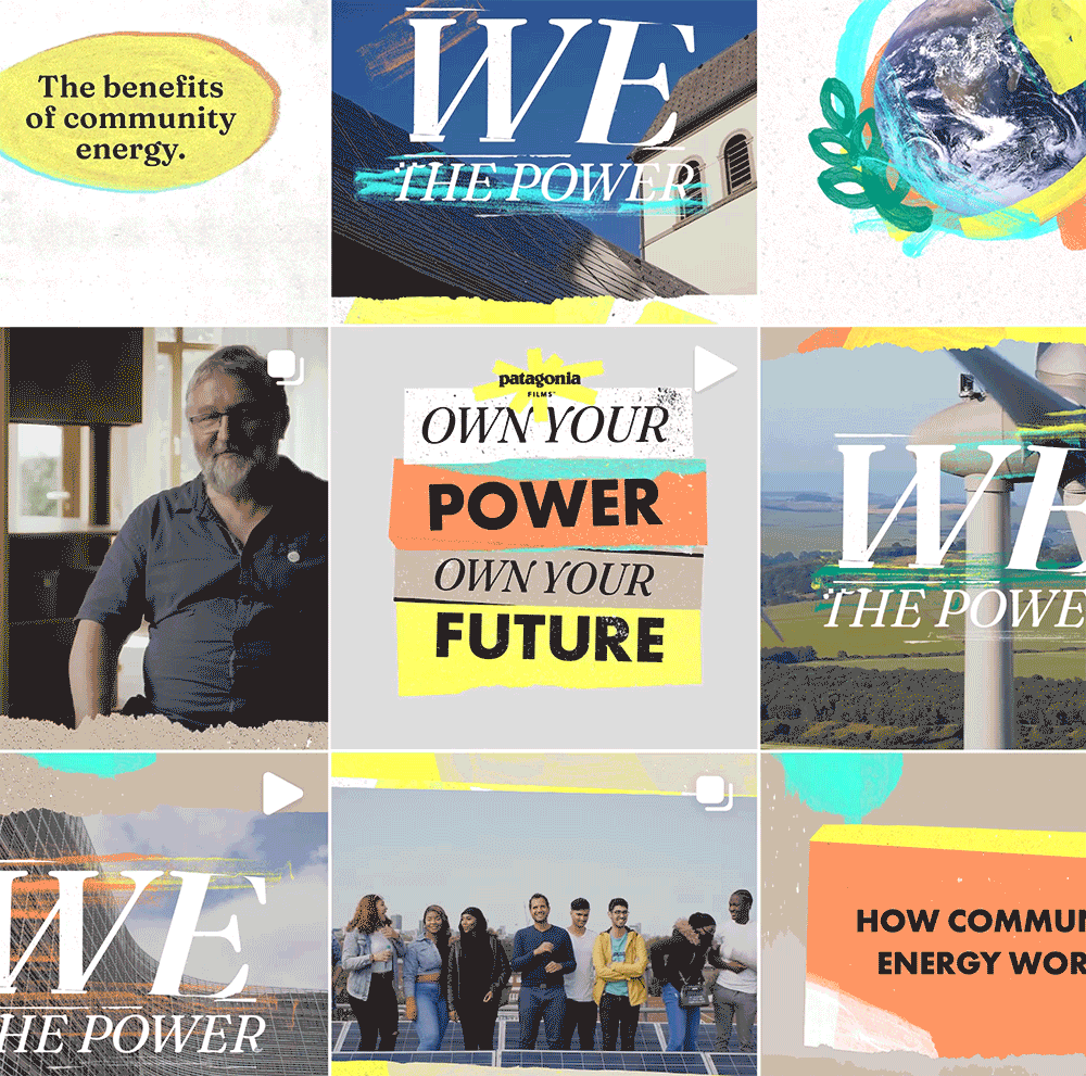
To prepare for the launch of this initiative, Patagonia teamed up with San Francisco-based studio Upperquad to craft a unique identity which translates the spirit of the movement into an energetic and organic system that truly feels community-first.

The branding stretched across venues both traditional and digital: a localized teaser campaign in select spots throughout the UK and Europe, storefront displays, street posters, social media, websites, community outreach, and more. Lively brush strokes and torn-paper textures create a DIY-aesthetic that reflects this grassroots, community-led movement. The bold serif and italics from Undercase Type’s Fraunces give the campaign messaging a high-spirited mix — approachable and positive energy blended with the urgency of this moment. The color palette features an explosive array of highly saturated tones which help energize a series of mixed media collages of hometown heroes and community groups affecting change in their neighborhoods. This fearless (and sometimes brash) graphic-look compliments these bold new community programs, where citizens are rewriting the rules and pushing back against monopolized power-generation.
Ultimately, the program is built to echo the DNA of the film and the movement — a pulsing drumbeat of heroes and hope, confidence and positivity, and most importantly, collaboration and community action.


Project Credits