
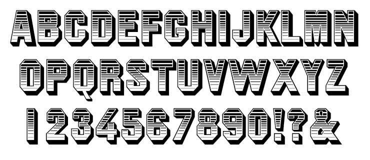
Throughout the 1960s, the gothic called “Jim Crow” was a popular typeface among fans of novelty; its virtue was a heavy dimensional drop shadow and the variation of light to dark horizontal lines inside the outline of the face. When in vogue, few users questioned the title or racialist implications. But as we’ve learned, the name and all that is ascribed to it were integral to the Southern apartheid system that ostensibly returned Black people to the victim-hood of antebellum white oppression.
The Branch Museum of Architecture and Design in Richmond, VA, is currently showing a provocative exhibition of typeface designs by Tré Seals, proprietor of the Washington D.C.–based Vocal Type. With curation by Seals, who collaborated on the exhibition design with Seattle-based Civilization, the show connects significant events and people throughout U.S. history and their relationship to the Black experience. Characters: Type and Progress features seven Vocal Type fonts each triggered by moments in history reflecting racial, ethnic and gender inequity. The faces are named after a key participant in each event: Harriet (Tubman), Ruby (Bridges), Spike (Lee), Bayard (Rustin), Martin (Luther King Jr.), Marsha (P. Johnson) and Colin (Kaepernick). Vocal Type also created VTC Terra especially for the exhibit.
Taken for granted as a crystal goblet, type has been employed in the propagation of good and evil. Although a typeface is not responsible for peoples’ acts, it certainly reflects—and brands—many deeds and emotions. “Characters illustrates the ways in which typography can be used both as a tool of oppression and liberation,” states Branch Executive Director Sharon Aponte. During a virtual gallery tour organized by Aponte, I asked curator Seals and Michael Ellsworth of Civilization, about the organization and goals of the exhibition at this critical juncture in American history.

What is the story you are telling through type? And how is Characters, the exhibition, expressing that story?
Seals: In this exhibition, there’s a panel with this quote that I stole from [Jean-Michel] Basquiat. It says, “my subject matter is royalty, heroism, and the streets.” Royalty, as in the people we credit for our rights and continuously celebrate: Dr. King, Rosa Parks, Eva Peron and Dolores Huerta, to name a few. Heroes, usually unsung, are the firsts. The ones that supported the royals raised them up, and rarely received credit. Take Bayard Rustin, for example. Mentor to Dr. King, introduced him to the nonviolent teachings of Gandhi, organized the march where King gave his “I Have a Dream” speech, and so much more. Yet Bayard was not allowed to speak at the march he organized simply because he was gay. Last but not least, there are the streets. These are the people whose small but impactful actions make movements move and whose stories must be celebrated as if they were those of royalty.
Ellsworth: The exhibit celebrates seven of the incredible individuals whom Tré named his typefaces after. Each of the seven includes at least one floor-to-ceiling portrait, and adhered to the portraits are what we call “time capsules.” These assemblages provide historical context surrounding the individual, the social movements they intersected with, and the use of typography in and around those movements. Throughout the galleries, there are also stacks of large cardboard blocks displaying characters (letters) from the typefaces in the show. In addition to helping surround the visitor in typography, they evoke some of our earliest connections to letterforms—children’s alphabet blocks. This is a nod to the power of the letter as a basic building block of communication, a tool that can be just as powerfully wielded for liberation as it can for oppression.
There are various “novelty” types that have been used to stereotype ethnic, religious, racial groups. Many of these (i..e. Hebraic Latin, “Bamboo” and “Chopstick”) are, in fact, used by the groups being stereotyped to sell or inform. Is it a form of self-caricature?
Seals: It is, in a sense, a form of self-caricature. However, more than anything, it’s a means of survival. These typefaces were created and used in a time when “authenticity” wasn’t a word widely used outside of collectibles. Nowadays, I find that there are so many culturally significant businesses that authenticity is needed to not only differentiate one’s business from another but to survive. I also think there’s something here about making themselves legible to a broader American public whose patronage is in some way required for their survival.


What are the typefaces or lettering that evoke stereotypes and/or denigrate the Black experience?
Seals: Nothing after ATF Jim Crow, now renamed VTC Ruby, comes to mind. However, in a much broader sense, I’ve always found it concerning how words and actions such as “stereotype”/“stereotyping” and “typecast”/“typecasting” are forever ingrained in the history of printing and type.

Have you found that there are indeed specific typefaces that represent people in good or bad or just silly ways?
Ellsworth: Beyond good or bad representation, it’s about recognizing the political power inherent in all forms of communication—including typography. Tré is not trying to provide a perfect, complete or even faithful representation of a specific group but invites a different set of historical references and dialogues into the field.
I recall using the Jim Crow typeface 50 years ago as a display face. I was ignorant of the racist reference. Do you have any thoughts about it?
Seals: In the exhibition, we explore the reclaimed, redrawn and renamed VTC Ruby, after Ruby Bridges [the first African American student in the segregated Louisiana school system]; we explore the tumultuous history of this typeface in the Characters exhibition. Beginning in the 1850s, a foundry in Boston stole the design from a foundry in France, made minor alterations, and renamed the typeface Gothic Shade. Come 1892, that Boston foundry merged with 23 other foundries to form the American Type Founders. In 1933, what was previously known as Gothic Shade (and several other names) was recast and renamed Jim Crow. From here, we explore the many faces of Jim Crow: from the 1800s minstrel show character to the Jim Crow laws of the 1900s. From there, we examine Jim Crow’s place in popular culture in films such as Dumbo. In the original version of Dumbo, one of the characters, an actual crow, was named Jim Crow. The Jim Crow typeface was also used on the lobby cards promoting the film. Last but not least, we conclude with the story of Ruby Bridges, the 6-year-old who single-handedly brought about the end of Jim Crow 1.0 by being the first Black child to integrate an all-White Southern school. While renaming this typeface has turned from a symbol of oppression (Jim Crow) to a symbol of empowerment (VTC Ruby), its history continues to shine a light on how dangerous the type and design world has historically been for Black folks and other marginalized communities.


The Nazis used Hebrew letter forms to ostracize (and ultimately murder) Jews. In the South during Jim Crow, so many different bold sans serif types were used in signage to exclude and segregate. But is that a function of the type or the words and the prejudice those words expressed?
Seals: It’s more about the words for me, as those same bold sans serif types have been used by abolitionists and Civil Rights organizations for just as long and just as often.
Can you cite examples where letter styles were (and are) re-appropriated, the way, say, Public Enemy once so powerfully recaptured the minstrel image in their song “Burn Hollywood Burn”?
Seals: While I’ve spoken at length about how VTC Ruby has done just that, I believe it is just as important to entirely rebuild the type design vocabulary from a different basis.
Ellsworth: Though not necessarily a letter style, one of the most powerful examples of graphic re-appropriation is the use of a pink triangle in Gran Fury / Act Up’s Silence=Death poster. This poster became the central visual symbol of AIDS activism. The pink triangle was originally used to identify homosexuals in Nazi concentration camps. In the 1980s, amid fears of segregation, quarantine and internment of people with HIV, using that same symbol became a double-edged sword. This story is prominently displayed in the VTC Marsha P. Johnson’s time capsule. This is another example in the exhibit that illustrates the power of words and symbols.


I’ve studied racial and ethnic stereotyping in cartoons, illustrations and commercial art, but letter forms seem harder to pinpoint in that light. What do you perceive as creators and users of letters that gives you pause?
Ellsworth: It’s about who has the power to create typefaces, whose ideas, biases (e.g., Chop Suey) and histories get embedded in them, and, therefore, both who get to see themselves in typography and who gets to be represented in it. Also, who gets the power to represent themselves?
Can alphabets, typefaces and fonts contribute to diversity and equality, or is this a matter of conjecture?
Seals: I believe my typefaces already have. When a designer makes the decision to use any VTC font, with all of its cultural and historical significance, in places and spaces where these stories and these cultures would normally never be seen or heard, that is diversifying design.
As for equality, that is a completely different task, for I only have one solution. However, before we start developing solutions for equality in an industry, we must define what equality would look like and how it would be maintained. This is how I see it. If approximately 14–15% of U.S. citizens are African American, then African Americans must occupy 14-15% of the graphic design industry (for example). The same goes for every other culture. How do we maintain that percentage? I have no clue. However, I do believe that to get to those percentages, we must begin introducing society to design and other career paths at earlier ages because, at the moment, simply knowing that design exists is a privilege. It needs to become common knowledge, and I believe that starts in high school or earlier.

