
A few months ago, a Uruguayan graphic design archive launched, thanks to Gabriel Benderski. The initiative encompasses Posters of Uruguay; Philately of Uruguay (postage stamps); Numismatics of Uruguay (coins and bills); Ephemera of Uruguay (printed matter); and now … a new Typography of Uruguay project. I asked Benderski and collaborator Rosana Malaneschii to tell us more.

What inspired you to create this?
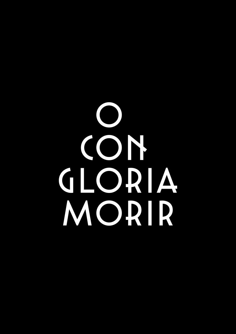
Typography of Uruguay rescues building labels to convert them into fonts. We affirm that the alphabet is one of the most relevant inventions of the human being. Typography must be the second one. We want to convince all Uruguayans that these inventions were, are and will be the most human thing that a human designed, designs and will design. An initiative that seeks to revalue our heritage is expected to have an impact on the Uruguayan society. It wants to position graphic design as a cultural provocateur—that is, a communicative channel that provokes knowledge. The objective is to demonstrate what the role of the graphic designer is. The most coveted consequence of the project is that a Uruguayan adds to his knowledge, what a graphic designer is and what jobs he produces. Only a small percentage of the population knows our role. In the minds of non-designers, the role of the graphic designer cannot be distinguished from other social roles. We lack identity; we need people to be able to identify us. It isn't known what identifies the professional graphic designer.
Human diversity causes versatility. The interaction process legitimizes the result. In order to achieve the desired effect, teamwork is required to exemplify precisely what our role is. The team is made up of: a type designer, an experience designer, a graphic designer, an architect and a writer and sociologist, Matías Fernández Di Iorio, Juan Martín Lusiardo, Gabriel Benderski, Jimena Germil and Rosana Malaneschii.
Also, we found the perfect excuse to introduce ourselves to drawing letters. The most difficult mission to achieve, in the world of typefaces, is to feel that a contribution is being made.
Relying on a solid conceptual party builds a tranquility with a rational sense and, why not, an emotional.


Was there a large Art Deco presence in Uruguay in the '20s and '30s?
It is tradition to consider the introduction of Art Deco in Uruguay hand-in-hand with the modernizing process. In this sense, it accompanied a certain economic and social strength and a redistribution of income. If we take architecture as a dialogue, at that time the architects were talking mostly with the neoclassical style and, at the neighborhood level, the action of the builders helped to spread the characteristics of Art Deco with greater or lesser solidity. Therefore, he is associated with "the new" and his presence was important. There are many buildings of this style that are still found in the streets of Montevideo to this day, as well as details of his proposal that can be observed. The question has a quantitative value, which is very important. It is possible to appreciate that the amount of Art Deco constructions today promotes its reconsideration at the patrimonial level and its tourist value.
From the heritage point of view, in recent years (2015) 81 buildings were integrated into the assets declared of heritage interest by the Montevideo City Council; many of them are in the Art Deco style. From all that has been said, it follows that the importance of this current is both quantitative and qualitative.


Was Art Deco or Art Moderne associated with politics as it was in Italy and elsewhere? Or was it an apolitical style?
This movement is linked in Uruguay to a historical moment of push and social transformations associated with the emergence of the middle classes. It was not an obligatory style, but rather it was an appropriate way and transformed by local taste and needs. Although it can be associated with the middle classes, it penetrated all social classes and there was a neighborhood Art Deco, executed not by architects, but by bricklayers and builders. In that sense, it was deeply political, since it constituted the adoption of a kind of social discourse that influenced the public space. It goes without saying that, precisely because of this, it transformed the urban landscape.
It is necessary to say that those decades of the 20th century were years of economic flourishing in which much was built at the state and private level. As an example of its significance, we can mention the Torre de los Homenajes (Arqto. Scasso, 1929), built in the Centenario Stadium. Said tower, with Art Deco characteristics, although not pure, celebrated the triumph of Uruguay in the Olympic competitions prior to '30 (1924 and 1928). Therefore, Art Deco is part of an architecture that sought to consolidate the national identity at a time when the country was looking forward.


Do you see a resurgence in the Art Deco aesthetic at home and abroad?
In Uruguay, Art Deco could be nostalgia. As is known, the country cultivates its memory, in certain ways, and there is the Night of Nostalgia, a celebration with a night dedicated, in different ways, to the past. It is celebrated every Aug. 24. As the style is a reference to a prosperous time, marked by a certain idea of progress, it lend
s itself to that nostalgic feeling of a past that, seen from a distance, seems comfortable, away from the tensions of the present. Historically, it could also mean a moment of social integration, when the country discovering itself began its march towards the future. A moment of optimism. Obviously, it does not seem to be an explanation not yet seen, so no, there is no explanation up its sleeve about this current that has not been enunciated.
Worldwide there are two exponents of Art Deco in the visual arts. The classic Louise Fili and the current Malika Favre. It can’t be a coincidence that they are both women. The aesthetics or what is considered beautiful for this movement is characterized by being refined, ingenious and powerful.


Do you have other historical interpretations up your sleeve?
Yes. Together with Rodolfo Fernández Álvarez we are currently developing the Assimakos Font. Assimakos used to be a carpet factory with a marvelous facade. This building was demolished a couple of years ago to become a new place for a store.
We were both interested in working on this project because it is still on the minds of all Uruguayans. Our society feels that part of our cultural heritage was lost. We seek to let people know that with a typeface, something lost in time can be rescued.


Eduardo Davit, the designer of the red building poster, was born in the first city founded in the Uruguayan territories, Colonia del Sacramento. He is carrying out a project that works on relevant buildings in Uruguay, including exploration of the Lapido Palace.
